Ohh Brother Podcast Branding
Ohh Brother was a pandemic-era podcast hosted by two of my best friends. In its short run, the podcast focused on themes including relationships and mental health.
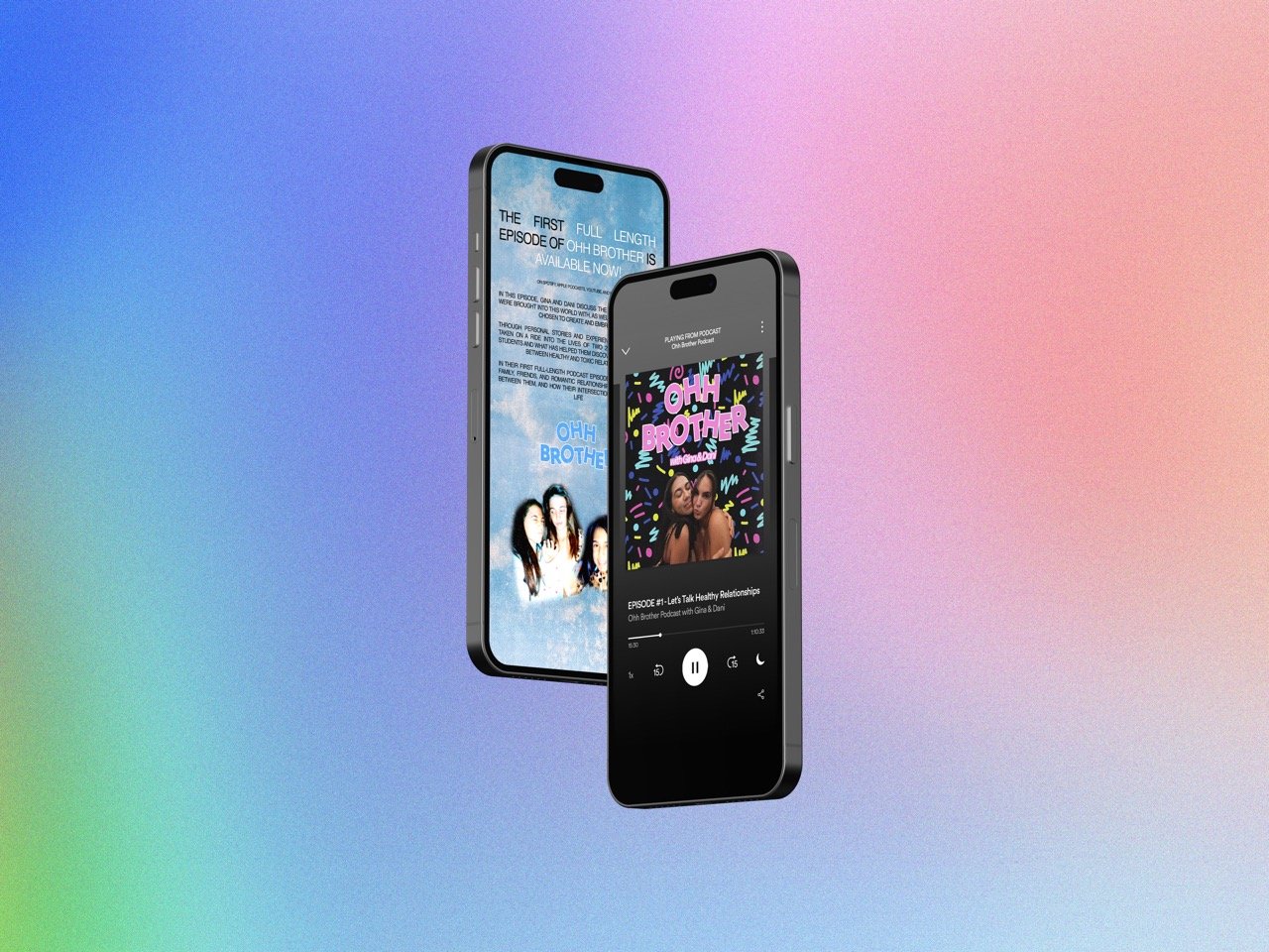
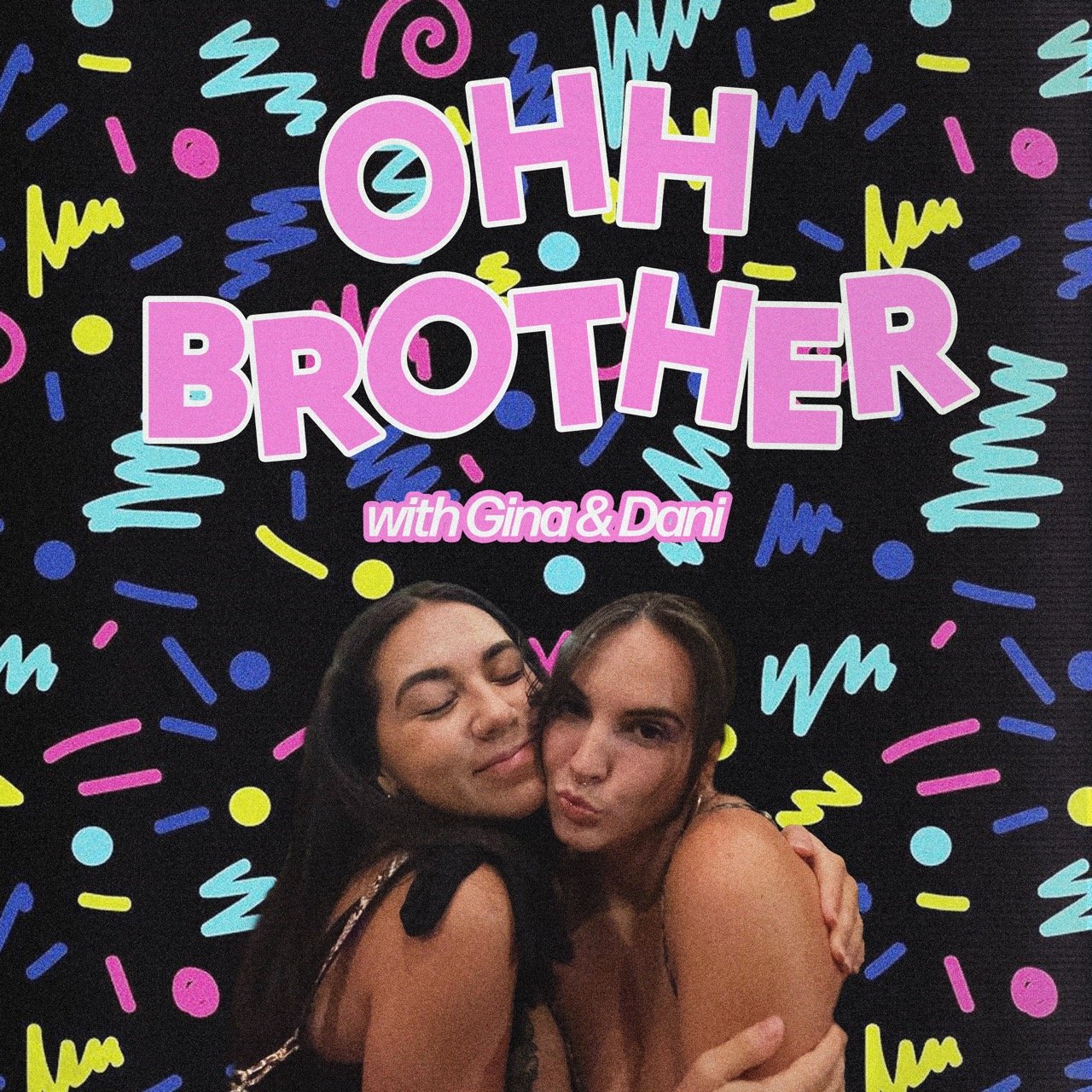
I created this brand identity based on the playful, inviting message the hosts hoped to offer their potential audience.


The use of Photoshop and various tools like text boxes, blending modes, and textures exhibits an advanced working knowledge of graphic design software. The deliberate choices in crafting a brand identity showcase proficiency in executing design elements. The employment of shape, balance, and hierarchy in the design demonstrates skill and depth of knowledge in design principles. The balanced composition, achieved through well-shaped photos and text boxes, establishes a compelling visual experience.
The design process reflects substantial time and effort committed to ideation, evident in the finished work. Faced with the podcast's name, premise, and hosts, the brainstorming for a logo resulted in a brand identity that resonates with the urgent desire of young women to have their voices heard. The creativity extended to social media promotion, notably in the Instagram story advertisement.
Adherence to given directions is clear, responding to the hosts' instruction to create a logo and cover design with a bubbly personality and retro feel. The incorporation of the roller-skating rink carpeting pattern and cloud design aligns with the specified direction. The final design exhibits excellent craftsmanship and attention to detail. Clarity and resolution of images, color accuracy, understanding of established grid and format, readability of typography, and appropriate conversion for print or screen publication are evident.